ShopDreamUp AI ArtDreamUp
Deviation Actions


Description


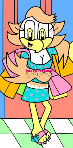
Pollyanna is one of the Eternity characters; Eternity is an original series I write. Find out more about it here! [link]
Featured at: [link]
This is the June picture for the Year-Round Challenge. This is also one of the few that takes place indoors. Pollyanna is hitting up some summer sales.
January- Camille Leone
February- Concorde the Falcon
March- Dixie the Heron
April- Jeremy "Rivet" Rivetkin
May- Mascara the Fox
June- Pollyanna the Hawk
July- Rosetta the Macaw
August- Sable Herisson
September- Static the Hare
October- Topaz the Cat
November- Triss Kaideka
December- Wraith the Dove
For critiquers: I intentionally don't shade; I prefer the look of flat coloring
Drawn and inked traditionally ,re-inked and recolored with Inkscape and PhotoShop Elements
Image size
258x521px 66.93 KB
© 2010 - 2024 Magenta-Fantasies
Comments4
Join the community to add your comment. Already a deviant? Log In
You're developing a good cartoon style. The smooth and solid outlines are very nice.
I know you said you intentionally don't shade, but for this picture I feel it would be really helpful. There is a lot going on with all the bright colors and the shopping bags swinging around that it is hard for me to tell what's really going on. Either shading or spacing out the objects may help make the image more clear.
I'm not sure what's really going on with her left wing. I see that part of it is cut off by several shopping bags without any straps. Is she carrying them? Is her arm suppose to covered by them? I can't tell...her wing seems to be overlapping the bags.
I find it interesting how you've decided not to use the feathers as her fingers as most cartoonists do and decided to give her an actual hand,
although it looks awkward. Perhaps making her have a clear wrist showing may help, and I also think you should make the lower joint for her thumb pop up more so that her thumb looks evident.
Her shoulders look a little tiny, try broadening them a little. And her left boob has a strange shape to it as if it's pressed up against something. It's not round like her other boob. Also, since she's a woman, she should have wider and curvier hips.
She seems to be placed in an off-balanced position. It seems like she is leaning judging by the way her legs are slanted, and it's hard to imagine that pose being comfortable seeing the way her feet are turned while the rest of her body is facing a different direction.
The background looks flat, though I would have let that slide if that didn't include the floor. It's good that you you tried to show with the squared tiles that the floor isn't going straight down like the wall is, but it still looks too vertical and not quite parallel. Studying and practicing perspective with backgrounds can help that, and working on perspective with characters can also help your art too. It can definitely help you understand anatomy better along with ideas for more interesting and unique poses.
That's my critique. I hope it will help (Smile)")
I know you said you intentionally don't shade, but for this picture I feel it would be really helpful. There is a lot going on with all the bright colors and the shopping bags swinging around that it is hard for me to tell what's really going on. Either shading or spacing out the objects may help make the image more clear.
I'm not sure what's really going on with her left wing. I see that part of it is cut off by several shopping bags without any straps. Is she carrying them? Is her arm suppose to covered by them? I can't tell...her wing seems to be overlapping the bags.
I find it interesting how you've decided not to use the feathers as her fingers as most cartoonists do and decided to give her an actual hand,
although it looks awkward. Perhaps making her have a clear wrist showing may help, and I also think you should make the lower joint for her thumb pop up more so that her thumb looks evident.
Her shoulders look a little tiny, try broadening them a little. And her left boob has a strange shape to it as if it's pressed up against something. It's not round like her other boob. Also, since she's a woman, she should have wider and curvier hips.
She seems to be placed in an off-balanced position. It seems like she is leaning judging by the way her legs are slanted, and it's hard to imagine that pose being comfortable seeing the way her feet are turned while the rest of her body is facing a different direction.
The background looks flat, though I would have let that slide if that didn't include the floor. It's good that you you tried to show with the squared tiles that the floor isn't going straight down like the wall is, but it still looks too vertical and not quite parallel. Studying and practicing perspective with backgrounds can help that, and working on perspective with characters can also help your art too. It can definitely help you understand anatomy better along with ideas for more interesting and unique poses.
That's my critique. I hope it will help